Monday, February 7, 2011

Sean Guerrero


I came upon Sean Guerrero and his work in a funny way.  I was working on my last blog about Liza Lou while the History Channel's Modern Marvels was on.  This particular episode was about Chrome and Modern Marvels spotlighted Guerrero as chrome sculptor.  Perfect timing :]  

Sean Guerrero is a sort of modern cowboy.  He grew up in Denver, Colorado, "rounding up" recycled materials for his art such as wood, plastic, and steel.  But he fell in love with chrome plated steel and to this day, chrome, particularly from old car bumpers, is his medium of choice. In his artist statement, Guerrero explained, "I remember as a kid I was always fascinated by the look of the cars that were built in the 1940's, 50's, and 60's.  The shape and design gave each one it's own personality.  I never would have imagined that I would one day make a living off of them the way I do.  Using cut up sections of those old, brilliant chrome bumpers, I reshape and weld their pieces into larger than life sculptures, preserving their essence."


 What he went on to say in his artist statement was beautiful, "I envisioned them (the old cars) as old buffalo that never completely decayed and crumbled into the earth again; different herds of steel buffalo-- Pontiacs, Chryslers, Chevys, and Buicks-- that all ran together on their prairies of concrete and asphalt."

Shown below is one of his medieval works depicting the battle between a fierce dragon and a knight in shining armor.  I love when he sculpts medieval knights! He has an entire gallery of horses but also themes his works around fantasy creatures and scenes, wildlife, sci-fi, function pieces, and even abstract pieces.


I love how Sean Guerrero gives life and animation to his works.  He does this a few different ways; One way is by placing different sizes or cuts of chrome in a way that depicts muscle structure and movement. Another technique is to fashion the individual pieces with different widths and placing them in such a way that implies (whether they are depicting feathers, mane, tail, or even a body mass) that they are in moving, being swept back by the wind.  I love art that has lots of motion or depicts movement.  The bronco to the right is my favorite.


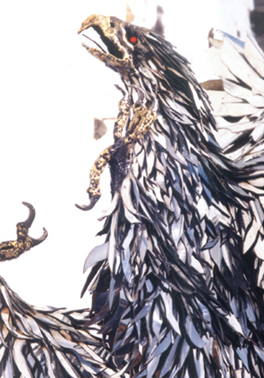
Some don't appreciate Guerrero's works, saying that the subject matter of his massive and most popular sculptures (mostly being horses, other animals) is too simple and that artwork should keep the viewer continually discovering. To me, what's fun about Sean Guerrero's art is that he loves and is fascinated by the materials he works with.  To me, that's the art of Guerrero's art.  He is obsessive about his work.

In Guerrero's opinion,"...by giving them back their dignity (talking about the old cars's materials again) through a reinterpreted form of physical artistic expression- a welded sculpture containing bits and pieces of their still recognizable original element- do I become a preservationist? ...Whether it's a 14 foot rearing stallion or an imposing Knight on a Horse, I feel that through the reinterpretations I've created over the years I've preserved their strength and style like a monument to their dignity."

Here are just a few more works that I couldn't bear to leave out of this blog.Here are couple examples of his "functional" pieces; car-bumper benches!


Some examples of his wildlife art that feels so natural.  Probably due to the size of the works and the muscle-like structure of the chrome pieces.   


Lastly, there is a monument in Land of Memory Cemetery (Hwy 287 N, Palestine, TX) which Sean Guerrero contributed.  The Monument reads: 


I love, love LOVE the movement and energy in this work.  It's absolutely breathtaking! I think Guerrero did a beautiful job integrating both bold and sleek chrome pieces in order to describe the angel's form.  The figure is balanced and resembles a hood ornament one would see on an old luxury car.  A fitting design for a form made from car bumpers!  This chrome piece is a tribute to all that Sean Guerrero's art is about.

Sunday, February 6, 2011

Liza Lou


Liza Lou, in my opinion is half crazy! She is headstrong and belligerent, yet she is brilliant and I'm a fan!  Bear with me on this blog... because of the magnitude of her work, one picture is just not enough...There is a lot to say about Liza Lou, $500,000 MacAurthur Foundation "genius" grant winner of 2002.

Lou was born in New York City 1969 but spent most of her early life in South California.  She attended the San Fransico Art Institute.  But she eventually dropped out of college due to chastisement from a professor she had nicknamed "Frogman."  
Lou works mainly with glass beads.  I find it interesting that she chose such a tedious medium, especially because she works with large, life-sized spaces.  Her style is unique and her works are, at first, whimsical and glistening with a sort of fairytale flare.  Her first major work was Kitchen, which took five years in the making before being finished in 1995.  She was 26 years old.  

Kitchen is 168 sq ft and is ornamented with an estimated 30 million glass beads; Every tile, dish, muffin, and bit of cereal, just glitters.  She applied each bead individually, by hand, using tweezers!  Real tiles and appliances were used as a foundation for her beads. Personally, my favorite portion of Kitchen is the sink.  I love how the water is portrayed.  I look at that facet spewing blue beads and can practically hear the water rushing out and the dishes sinking and clanking together as the sink fills. 

 The beads seem to immortalize or rather, memorialize this suburban kitchen.  Kitchen tells a story of a woman's toil.  Kitchen glorifies the perfect suburban woman, yet also shows how inhuman the perfect suburban woman really is.  In Lou's words, "I'm referencing women's experience in the piece. The requirement is to have a really fastidious clean house. And, in today's culture, to be a babe at the end of the day. You have to be cute … The task never ends."


During the five years of construction, Lou supported herself with a waitress job, selling prom dresses, and any odd jobs she could find.  As stricken as I am by this piece, I can't help but chuckle to myself that, for five years, she was a woman who toiled in the kitchen.  The message of Kitchen is clear, but ironic.

Liza Lou's next major work was Backyard, roughly 600 sq ft finished in 1996.  Lou's explanation was simple and logical, "standing in front of the sink, what do you see? The backyard.  I've always been inspired by the suburbs.  This is really my landscape." Which is logical, due to her also living in Southern California.


 The most amazing thing about Backyard is the lawn.  Each blade of grass is actually a strand of wire that has been hand-beaded and inserted into a paper mache surface (which actually gave the piece better mobility as it was lighter and easier to install and de-install.) In fact, the commitment the lawn demanded was so massive that Lou had to humble herself and recruit volunteers to help her bead all the individual blades.  She would have beading parties!  So I think the lawn, itself tells a story of many different american's lives interacting with each blade that was beaded.  I really liked Liza Lou's perspective, "With 50,000 square miles of lawn in this country, the lawn truly is a symbol of America."

 Backyard also has fewer actual objects as foundations for the beads.  I figure Lou regretted the real objects because of their impracticality when it came to moving the display.  Personally, I enjoyed the foundation of real objects and found myself looking for specific items, like a game of "ISpy."


Despite the glamour, Lou's works can also often be dark and even devious.  There are social, emotional, and political messages lying beneath her glistening intricacies.  Below is an example of her dark story-telling; Trailer, a Spartan Mobile Mansion (1949) whose interior was completely refurbished in Lou's glass beads (1999-2000).  


Trailer looks like it's strait from an episode of CSI.  The mobile mansion is filled with magazines, cigarette implications, guns, distasteful magazines, a typewriter and beside it, what appears to be a suicide note.  But most shocking is the man's leg lying in view of the doorway of the small bedroom, completing the eerie and forlorn feeling.  Lou explained, "I realized there had to be that leg at the very end... something has gone wrong.  It's a crime scene.  It's ver opposite visually of the kitchen, because it's absence of color.  And the trailer piece is that dead place."
Trailer was an interesting turn in her works story telling.  It is a bit more narrative than Kitchen (mostly due to the leg.) As Lou put it,
"I really was taking objects and using them in order to describe a feeling of despair, loneliness, and isolation...
It's just that I go interested in the darker side and making it visually seductive.  That's always my aim, to bring you in and tell a story."


To me, it's amazing how glass beads could paint such an extraordinary picture for the viewer.  That's my favorite aspect of Liza Lou's works: they tell a story."

Thursday, February 3, 2011

Jason Rogenes

Jason Rogenes (left) is an artist who discovered his favored raw material while he lived Los Angeles, a commerce-driven, big-box store, strip mall environment where polystyrene was inexpensive, abundant, and easily obtained.  To the average consumer, these raw materials have a sole purpose to package and protect what are considered valuable goods in the commerce world and are simply disposable byproducts... but Rogenes saw potential in them.

   Jason Rogenes's works are a wonderful example of material transformation art.  His works explore spatial intuition and architectural fantasy and display craftsmanship and artistic vision with everyday materials that are familiar to our society; mainly being cardboard, Styrofoam, and various electrical components.  He transforms these ordinary and boring packing objects into forms of architectural beauty by stacking, attaching, and placing one inside another.  He carves each pre-molded piece by hand before fitting them all together and fastening them with plastic glue.  Rogenes repeats this process with anywhere from five to 100 or more individual components, creating pieces that recall space stations, satellites, cities, totems, and modern chandeliers.  His use of electrical components to light up the Styrofoam give his works a celestial appearance.

This particular work is named diagram 3.13c.  It is installed in the Manuf®actured Museum at 101 California Plaza SF, CA in 2008.  It is 216 x 109 x 18 inches.  When I look at this work, I feel like an traveller emerging from mountains, onlooking a glorious white city.  I believe the mountainous feel comes from the triangular peaks and layers of triangular cardboard.  These geometric cardboard shapes sort of frame the  styrofoam architecture and act like subconscious arrows, pointing the viewer where to look next.  The styrofoam has a regal and unearthly aura that casts many different shadow/contours on the big, bold planes of the cardboard, making the two materials (and the lighting) work together harmoniously. 

   I really like the way that Rogenes turns an ordinary material with no value into something beautiful and glorious by lighting it strategically.  The work shown on the right is named diagram 3.03c and is also an installation in the gallery described for diagram 3.13c (shown above).  Once again, the cardboard seems to frame the styrofoam centerpiece and guides the viewers eye, and helps to contain the light.  I love the very clean, industrial feel to these works.  Below is the centerpiece of the gallery, site-specific installation, 2008; made of EPS foam inserts and electrical components.  It reminds me of a space station.  I love how he has suspended this massive creation, making it look as thought it were moving through the room yet caught in a still frame.  I think he is ingenius to use materials who physical properties are lightweight yet display sturdy bulk and mass.  However, I think his use of electrical wire is sloppy.   

  
    I don't like how the orange extension chords hang about.  For me, it gives the gallery an unfinished feeling and takes away from the beauty of the forms being displayed.  I would've liked to see him hide the extension chords with a goal to make it appear as though the forms are lit up internally from some sort of life force. 
   Despite my small suggestion, I still believe that Jason Rogenes is brilliant and his works are unique and powerful.  A fun thought is that his artwork also saves room in a landfill.  Anyway you look at his work, the message is clear that even an "invaluable and disposable byproduct" can be turned into something of beauty that anyone can appreciate.